5 min read
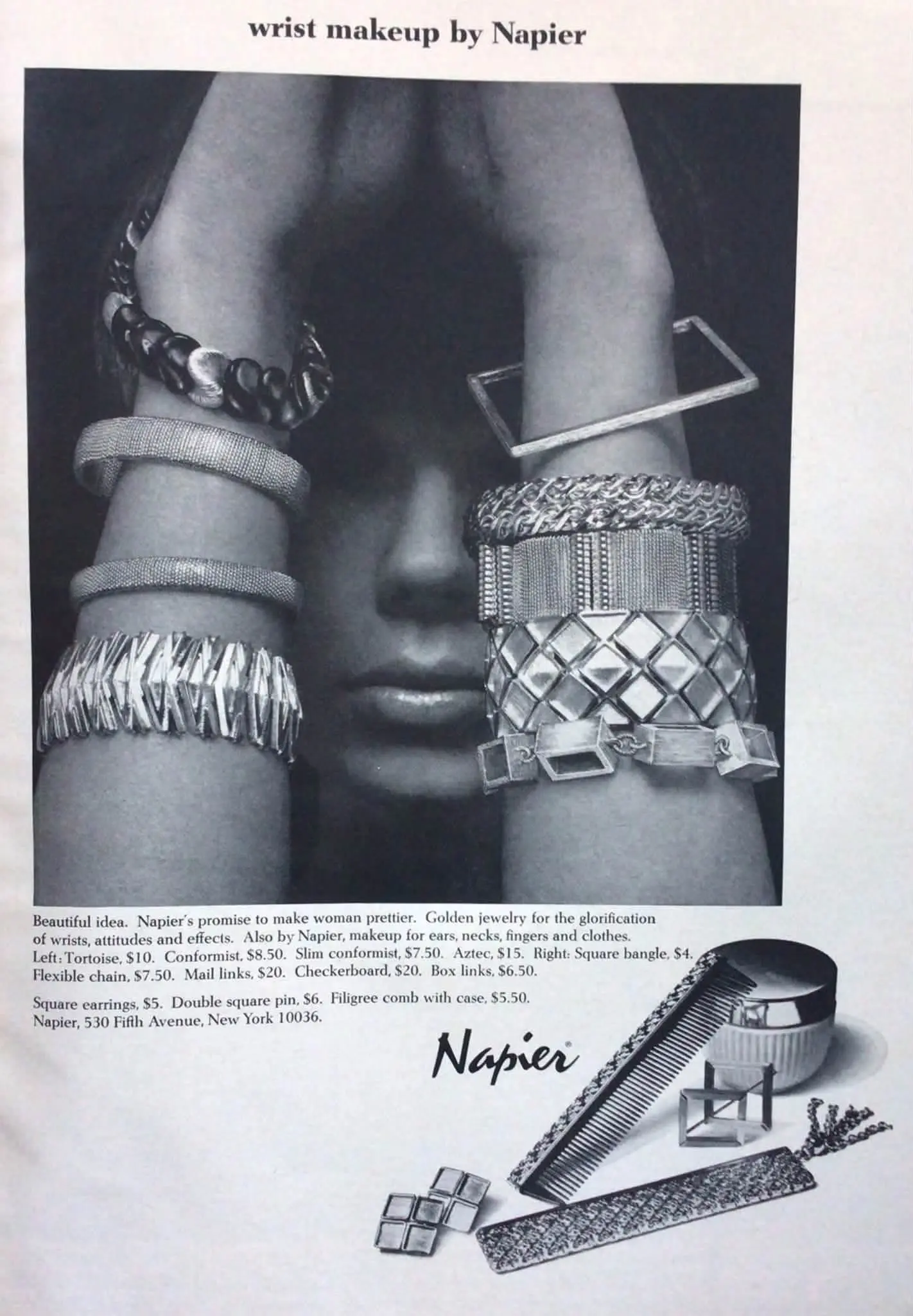
A closer look at a Napier advertisement combining geometric and linked bracelets through the language of makeup.
Article Content
“Wrist makeup by Napier”: the advertisement uses a cosmetic metaphor to present bracelets as details that decorate the wrist and contribute to an outfit. Although the photograph is black and white, contrasting shapes and surfaces distinguish the pieces.
Wrists at the centre of the image
The woman raises her arms in front of her face, bringing the bracelets into the foreground. Her face appears between them, while the jewellery occupies much of the photograph.
This composition can be read as a way of making the products the main focus: their proportions, textures, and relationships become apparent before we read the accompanying copy.
More than different widths
The selection includes an open square bangle, finely textured bands, intertwined chains, geometric links, and a broad bracelet with a repeating raised diamond-shaped pattern.
The printed names include Square Bangle, Flexible Chain, Checkerboard, and Box Links. These help describe the collection’s forms without establishing its material composition.
A monochrome photograph with a golden description
The copy describes the jewellery as golden. That wording alone does not establish solid-gold construction, fineness, or a particular plating method.
Similarly, the product name Tortoise is not sufficient evidence that a piece contains natural tortoiseshell.
Why call jewellery “makeup”?
The copy extends the metaphor to jewellery for ears, necks, fingers, and clothes. It can be interpreted as a marketing device that presents accessories as finishing touches.
The accompanying promise of making women prettier belongs to the advertisement’s persuasive language; it is not an objective result demonstrated by the photograph.
Taking inspiration without copying the whole display
The numerous bracelets can be understood as a visual presentation of the range rather than a prescription for everyday dressing.
As a styling exercise, wear one bracelet you already own, then add another with a different width or texture. Compare them with your sleeve and move your wrist, noticing comfort, sound, and contact between the pieces. These are practical suggestions, not rules established by the advertisement.
Keeping the details in context
The advertisement lists product names, dollar prices, and a New York address for Napier. These are printed details of the original offer, not current prices or present-day valuations. No clear publication date is visible in the supplied image, so a specific year is not assigned.
The image offers a starting point for experimentation: compare shapes and surfaces, then choose a combination that suits your preferences and everyday movement.
From the Memory of Days
Rana Elgogary ᥫ᭡
Expert Tip
«Start with one bracelet, add another, and assess both appearance and comfort as you move your wrist.»
Conclusion
Napier’s advertisement presents bracelets as “wrist makeup,” using close-up photography to highlight contrasting shapes and textures.